
Note that I used Scale 75 colors for these models (from their basic line and their Fantasy and Games line). Feel free to swap out comparable colors from other manufacturers.
I started off with a basecoat made from about a 60%/40% mix of Arphen Jade and Joryldin Turquoise (using more of the turquoise).


Here is what the color looks like when mixed together. I put the basecoat on using 2-3 thin coats. You can see what it looks like on the models as well.


For the first layer I mixed a lighter blue-green by mixing roughly 50%/50% Caribbean Blue and Adriatic Blue. You can see the approximate opacity of the paint in the image where I put the paint on a piece of paper with printed text.


Apply the paint with your brush motion sweeping towards the higher areas and away from what will be the shadows. [Kujo Painting has great video tutorials on what I mean by this. If you can't picture it look him up on YouTube! :) ]
Here is what the models look like after this first lighter layer color.


For the next few layers I started adding small bits of Moonray Flesh to the mix. Again, I kept the paint thin and made sure that my brush was moving away from the shadows and towards the highlight areas. Do this a few times until you are happy with the color (adding small amounts of additional Moonray Flesh each time).


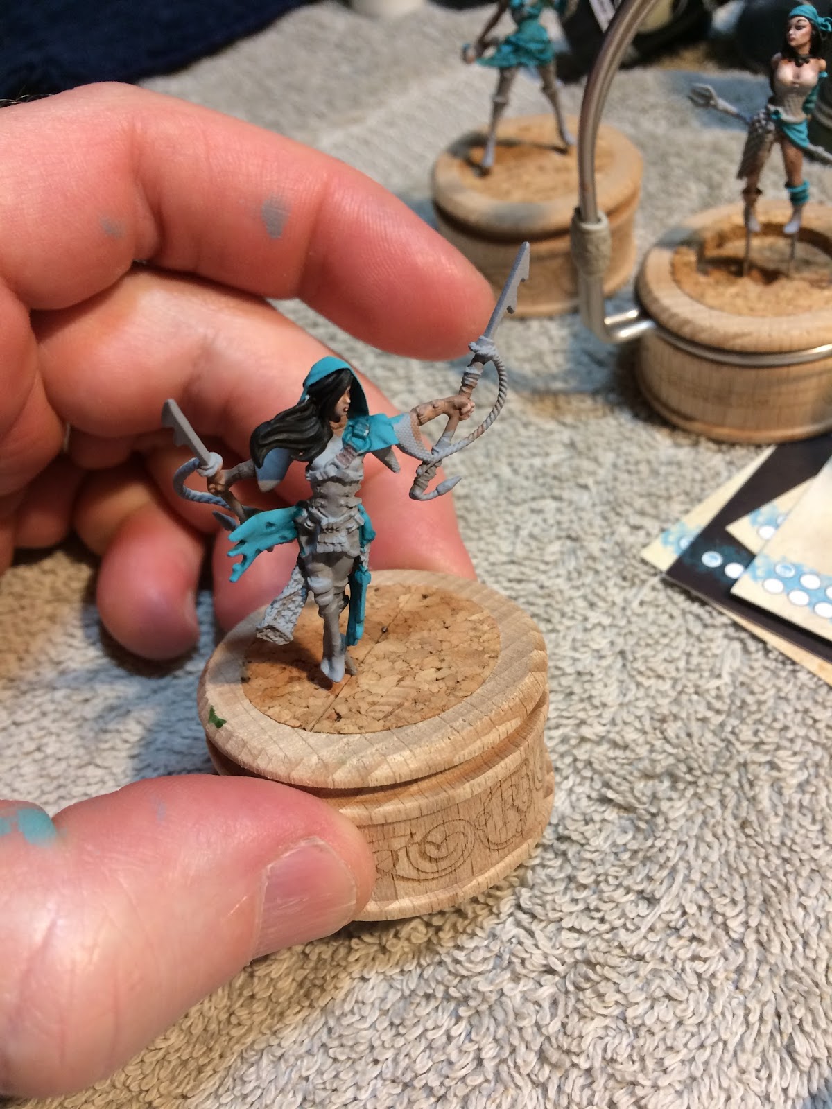
Unfortunately I didn't get pictures of the models at every single stage. This is what they looked like when I decided I was happy with where the color ended up.


At this point I added a much larger amount of Moonray Flesh to create my final edge highlight color. I used this only at the points of the most extreme highlights.


It's a little hard to see in these pictures, but the highlights created this way are pretty stark, and since this is cloth I don't want them to stand out too much (as if they were reflection points on metal for example). So I mixed up a very thin glaze of my first layer color and carefully glazed over the areas I had painted since the basecoat.


Now on to the shadows! A good technique for interesting shadows is to mix a complementary color into your base color. This naturally desaturates the base color helping your highlight colors to really pop.
Since my base color was a blue-green, then a nice warm red is the natural complement. I mixed a small amount of Aldebaran Red into the base color (not too much - a little goes a long way!). I then started glazing this color into the shadows. This time my brush strokes moved away from the highlights and towards the deepest parts of the shadows.


More Aldebaran Red and moving deeper into the shadows...


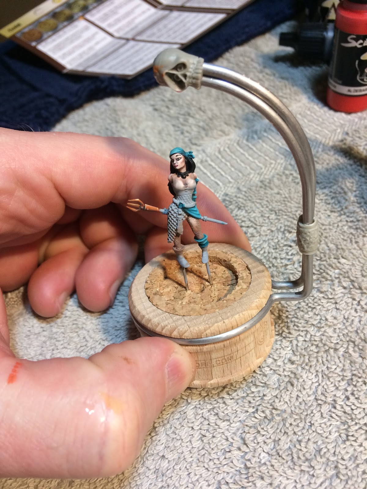
I finished the copper on these guys recently, so here you can see how the color looks next to the copper NMM. Thanks for looking! Let me know what you think. [Note that I did not include a picture of Siren for this last stage because I messed up on her copper swords big time and need to start over from scratch on those.]


No comments:
Post a Comment